I created and managed Blackboard Learn’s Design System to lead quality work at efficient speeds and improve the customer experience.

When I arrived at Blackboard, they needed to improve the product’s consistency and find a way to be more efficient in designing and developing.
The first thing I did was build a team:
- I hired two designers, one developer, and one content writer and collaborated with two accessibility experts.
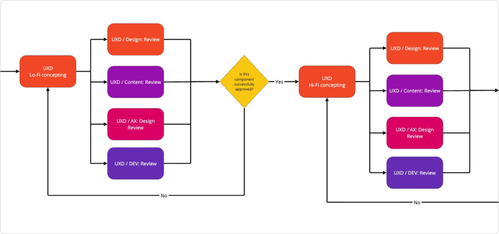
- I defined the work process with different stakeholders, and my team and I iterated over it and switched until we were satisfied.
- We defined goals, values, principles, purpose, and expectations. Everything to make collaboration productive, happy, and stress-free.
Component libraries
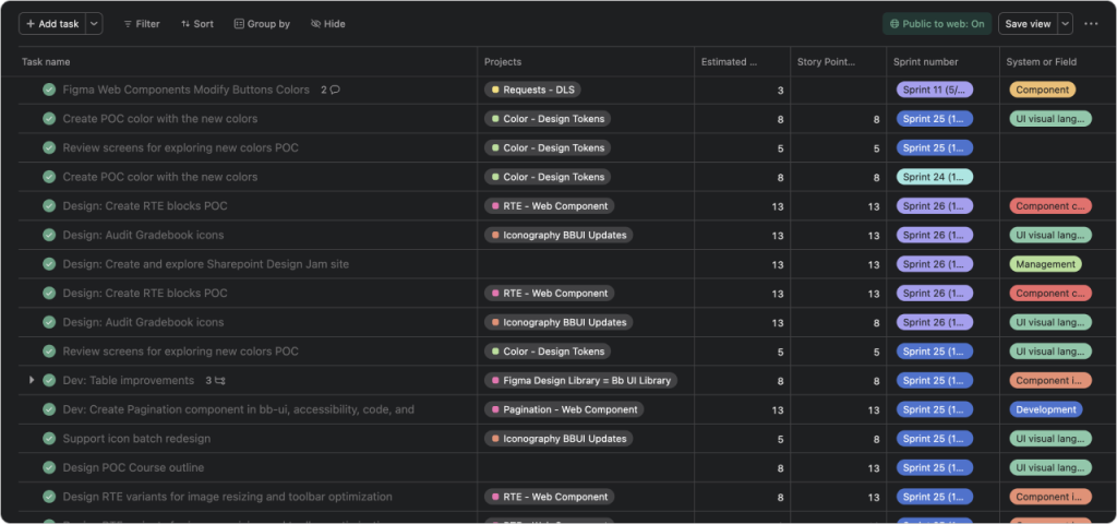
After getting our house in order, we started to work fast, with quality, and in each sprint, trying to improve how we do things.
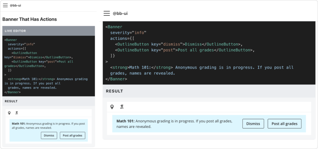
- We created two libraries named bb-ui and figma-bb-ui.
- Before developing any component, we researched, prototyped, and validated with the developers, designers, accessibility, and content specialists.
- All the components have high standards of accessibility and usability.
- All components are responsive, designed, and developed with mobile devices in mind, following best practices and principles.
- We support right-to-left directionality.
In this Figma embed, you can explore the Chip component for the figma-bb-ui library: states, sizes, types, directionality, and dark theme. For better usability, you can go fullscreen.
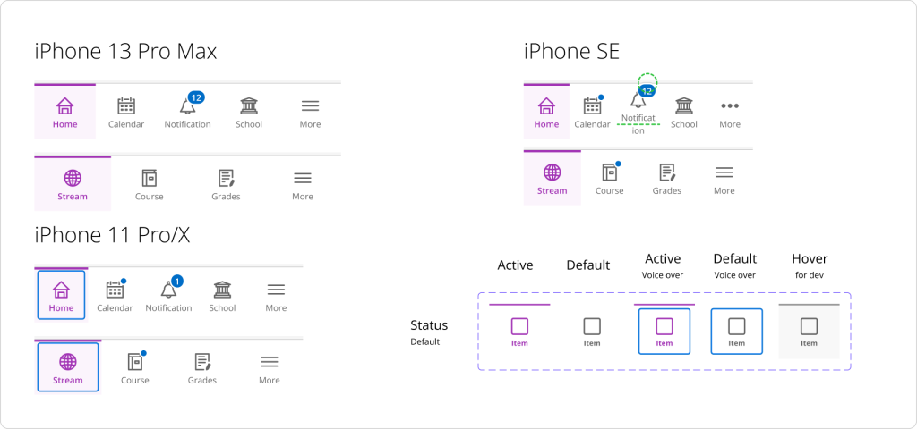
Mobile Design System
We also added mobile-specific components to the system because of platform-specific consistency, cohesion, and scalability. We were bridging the gap between responsive design and native UI patterns, empowering teams to build cohesive, efficient mobile applications.
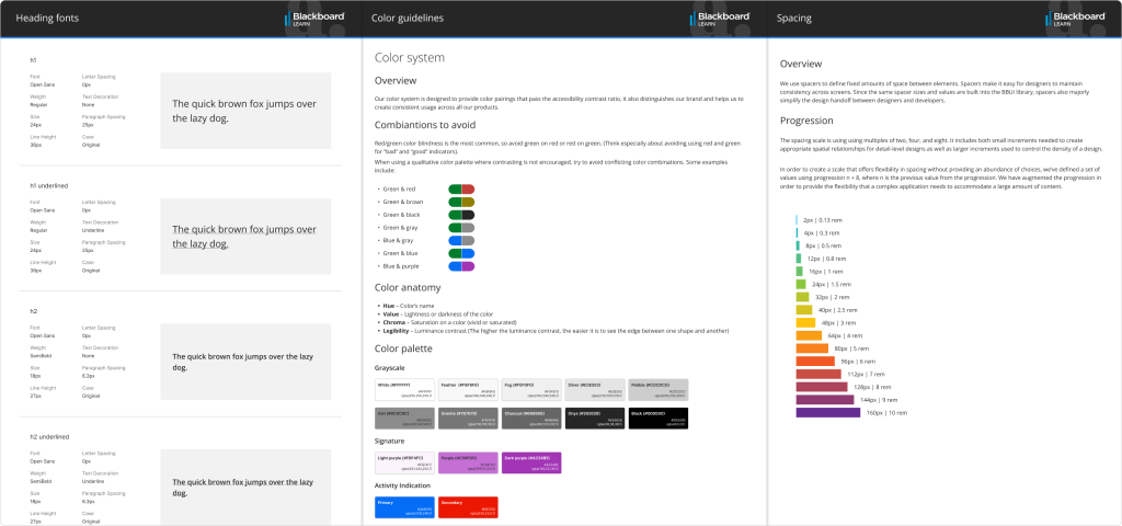
Foundational stuff
Mmmm, this should be before the components, but anyway. This is the core, the foundational building blocks that comprise all our user interfaces. With my team, we defined:
- Typography: Font family, weights, sizes, line height, line length, variable names, and usage.
- Color palette: Contrast ratio, variable names, usage, light and dark mode.
- Spacing: Progression, harmony, and grids.
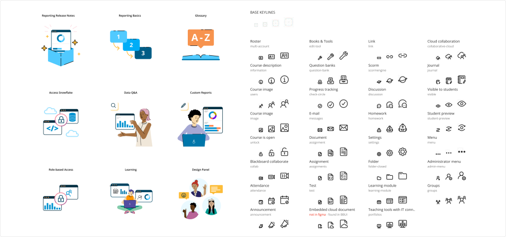
We also create a system for iconography and illustrations:
- A workflow for requesting icons/illustrations and adding them to both libraries.
- Guides, principles, and samples.
- Different sizes and applications
Our design system revolutionized collaboration. Designers and developers synced effortlessly, using consistent components. Users reaped the rewards—a seamless experience across our products.